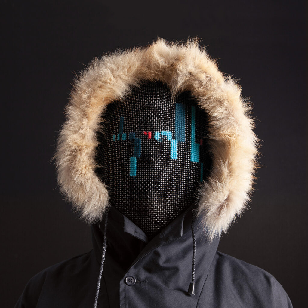
Surprise oldskool team trivia! The cover artwork for the Ugress album Black Anorak is made by Kåre Martens, who also did the legendary Loungemeister music video!
On the previous album The Wrong Future I worked with Stephan Hövelbrinks, whom also like the Loungemeister video, works with pixel-based art. I really love this style, and the artists making it are often super nice individuals. But more than a style it is also a “heritage”, of growing up with computers and expericing the main wave of digital art coming of age. I think pixel-art is more than just an art-style, it is a shared mind and particular love and respect for art, games and media, presented and represented digitally with care and detail.
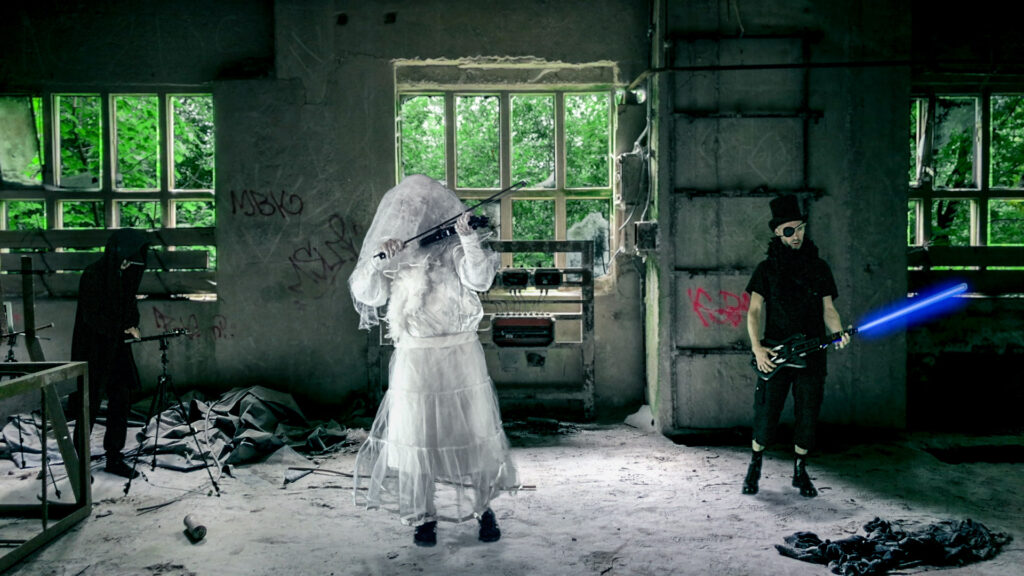
The Loungemeister video was directed by Magnus Martens, and all the graphics and animation was painstakingly hand-drawn by Kåre Martens and his team in Australia. With pixel-art as our “historical connection” I asked Kåre Martens now 15 years later, if he would like to do the cover artwork for Black Anorak. But completely open, however he would prefer to do it, no direction or requests, but with references and connections if he’d like to have them: He got an early draft of the album, and an early version of the Toil 22 music video, with the tree “anoraks” roaming post-apocalyptic landscapes.
The process of releasing Black Anorak was both messy and hectic, for everyone – everything came together at the last minute, and it was for a long time undefined if there should be a single, and which track would be the single. Eventually we landed on Toil 22 as the single, but The Deepest Veil was also considered for a long time. Kåre patiently and thoughtfully made prototypes and artworks for all of this.
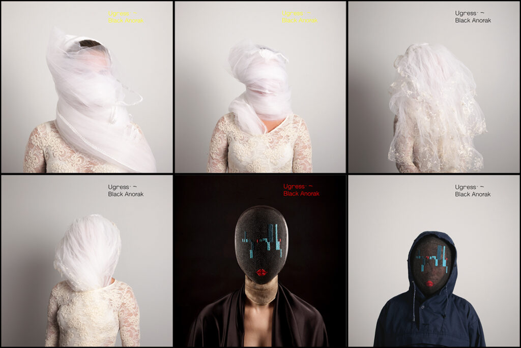
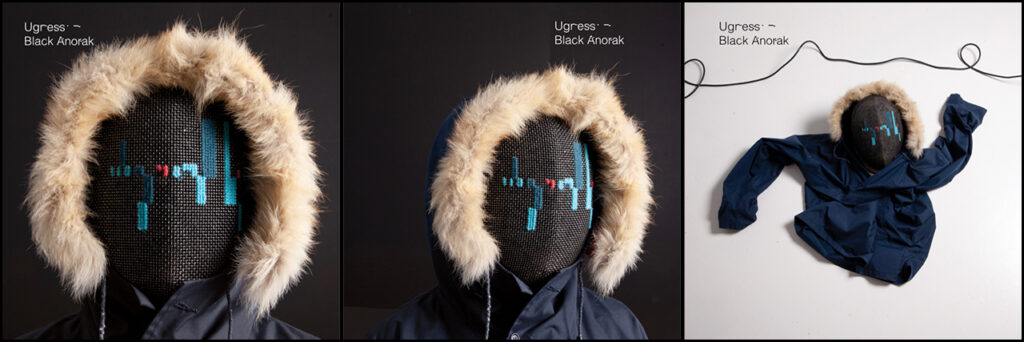
The first prototypes for the cover was a mixture of photographs in different directions, and at first I wasn’t too sure about the bridal ones – I liked the weirdness, but also felt them “too nice”, they felt too clean and “controlled weird”. But I really liked the fencing mask, and the “digital waveform” embroidery on that. And I liked the kind of “lost” posture of the last photo, eventually we choose these ideas as the main direction.
(Later, I felt more charitable towards the bridal veil direction, particularly when considering The Deepest Veil as single, but as we decided Toil 22 for the single, they fell out.)
From there it was just details and small things – like posture, size, background colour, anorak tone, the type and title. I think we only went through one or two revisions of “adjustments” and Kåre nailed every request swiftly and elegantly.
I really liked the font and style of the suggested title, with the glitchy lettering, but for digital releases I’ve always felt that repeating the title both in the artwork and in the listening app is a bit much. Unless the title is an integral part of the artwork, I’d rather leave titling to the listening platform.
I am super happy with the Black Anorak artwork – both in itself this weird, faceless character with embroidered digital waveforms on their mask, that kind of looks like a speaker grille. The anorak and ambiguous expression fits very well with my own strange connection to nordic wilderness and folk tones, mirrored in the music. The design process and art conversation with Kåre was great fun, and I love to see how both of our works, styles and directions have developed since our previous work in 2003.
It is slowly starting to dawn on me that Ugress is actually a life-work, this is what I do and always will do. Releasing music and caring for the graphical representation of that is a project that will grow and develop over a long period of time, and in itself make a lot of exciting connections. I am very much looking forward to all kinds of new collaborations and influences, to see where this leads, but also like this, revisit old connections and see what comes out of us… 15, or 30, or … 50 years later.
