The Wrong Future is the first Ugress album to come out on vinyl in ages. The limited edition is now available exclusively from our Bandcamp store. The cover artwork was designed by Stephan Hövelbrinks. In this post I’ll show some images and notes on the artwork process.
Stephan is a independent game developer and designer, also known as Talecrafter, currently developing Death Trash. He works with pixel art, which is my inverse kryptonite. JUST WANTS.
I have been a long time follower and admirer of his work, and when the concept and “tone” of The Wrong Future started taking shape, Stephan was without any doubt my first and only choice for designing the cover. Here are some examples of some of his work that I fell in love with:
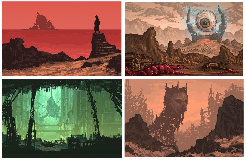
Works by Stephan Hövelbrinks aka Talecrafter.
I contacted Stephan earlier this year and was very grateful to learn he was able and interested in working on this, in a time that was very hectic for both of us, me wrapping up the mix of the album and Stephan preparing a playable demo of Death Trash to show at the PAX East indie games conference. We set up a contract and structured a development process of sketches, feedback and revisions to reach the deadline of delivering the album, and got to work.
I gave Stephan complete artistic control of the artwork – he could make anything he wanted – but also gave him some references of his work that I really liked, and also gave him some stills and previews from the live shows and upcoming music videos, so if he wanted to include elements from that “world”, he was free to pick anything.
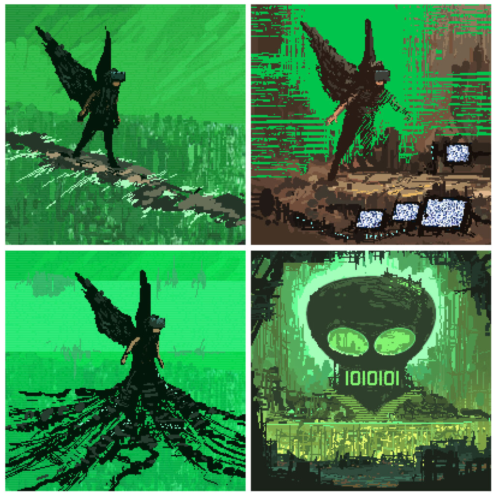
First rough sketches for cover artwork.
The first rough sketches that arrived (above) made me super happy and very enthusiastic. They all contained elements that I instantly fell in love with. The “black angel” is partly based on a character I become during live shows, that ends up performing the “The Little Cloud…” as a kind of lost, confused VR-angel, rooaming a time-shifted metropolis, singing glitchy, interrupted cries for “somewhere over the rainbow”.
Gisle Martens Meyer performing Ugress live in Barcelona. Photo by Vincent Guillerm.
I love that in the cover artwork, it is impossible to tell if the Black Angel is actually raising UP from the trash of electronic devices, or if the electronic trash is holding him back. I was in the process of mixing and finishing the album, and at that time I choose to interpret it as a an angel raising. Realizing this – the duality of what electronic devices can do to us – was an important moment in the development of this album. It is a bleak and dystopian album, but it is also playful and “cartoony”, and I was very grateful that the cover artwork started taking a shape that could also be seen as “hopeful”.
Having this Black Angel striding through a deserted circuitry-landscape with an ambigous tentacle-swarm of electronic trash was Stephans brilliant idea, it gave the album a visual identity that resonates with the topic and design of the music, and we quickly agreed that this image, the character, the landscape and the electronic trash heap was the main direction to follow.
Working out possible directions of details in the artwork.
The next step was figuring out which smaller details to include in the artwork, the kind of “world” of the Black Angel. We went a bit back and forth trying to include both the dead screens and the Ugress logo in various configurations, I so desperately wanted to keep the awesome “Skull Temple” from the first sketches, but I think we both felt that we were trying to fit too many elements, the landscape became too complex.
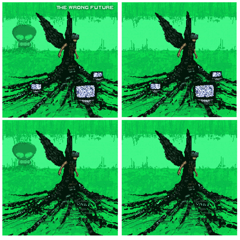
Eventually we settled on a version with the Black Angel, raising up from the Electro Trash with the Dead Screens, and we actually kept the logo – but its hidden in the circuitry landscape. Can you find it? 😉
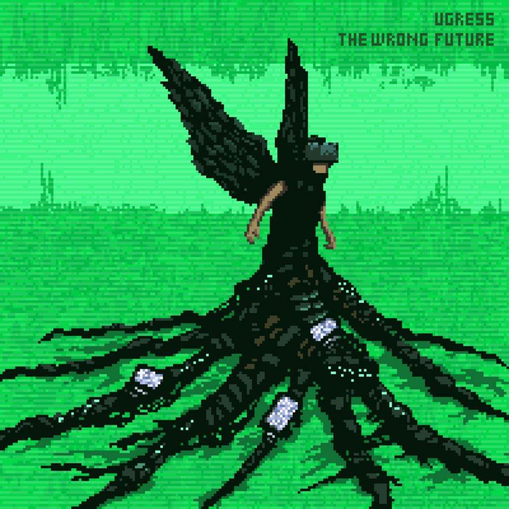
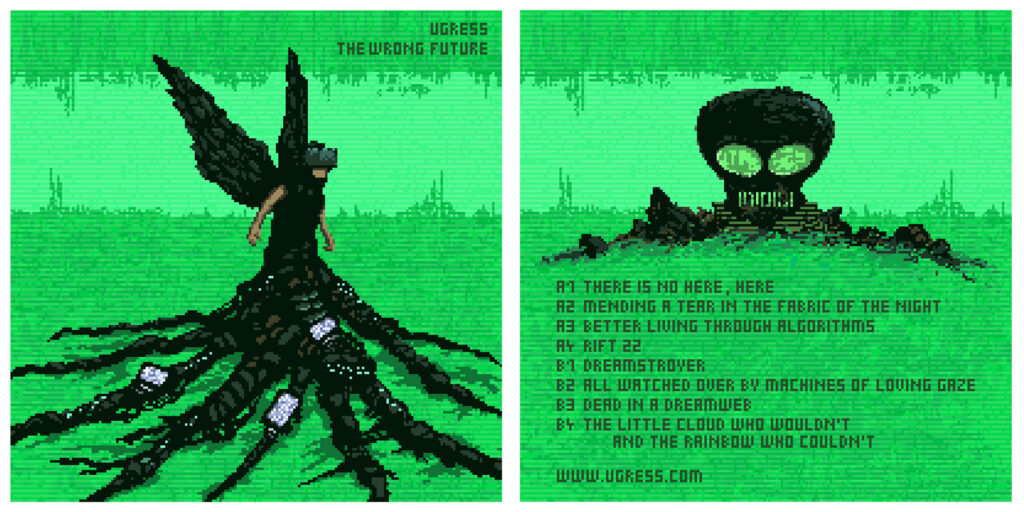
Vinyl front cover for The Wrong Future.
For the vinyl artwork, which also needed a backside, this was designed a few weeks later for the crowd-funding campaign, and now we could finally bring back the mysterious Skull Temple based on the logo.
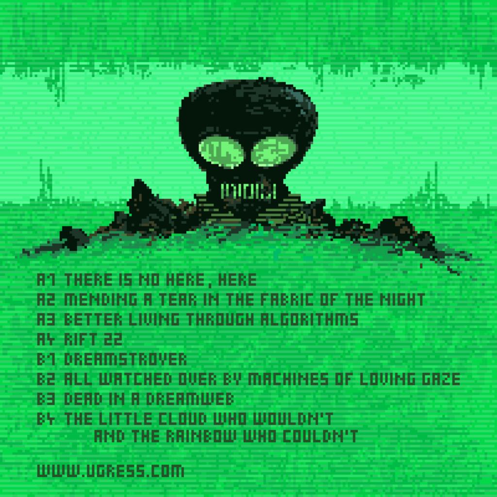
Vinyl backside for The Wrong Future.
We also spent some time discussing the font, and the amount of text. Again, we decided to reduce it in complexity as much as possible. For digital releases, the cover has no title at all – artist and title is always listed with the listening app anyway, so its superfluous.
For the vinyl release, the title is written in a pixel font with the same resolution as the artwork. We decided to keep it as pure and simple as possible. The artwork is made in 200 x 200 pixels, and none of us liked it when we tried mixing in text in a font face that had another resolution. So we decided to keep everything in the same resolution, and Stephan patiently drew the text and letters by hand…
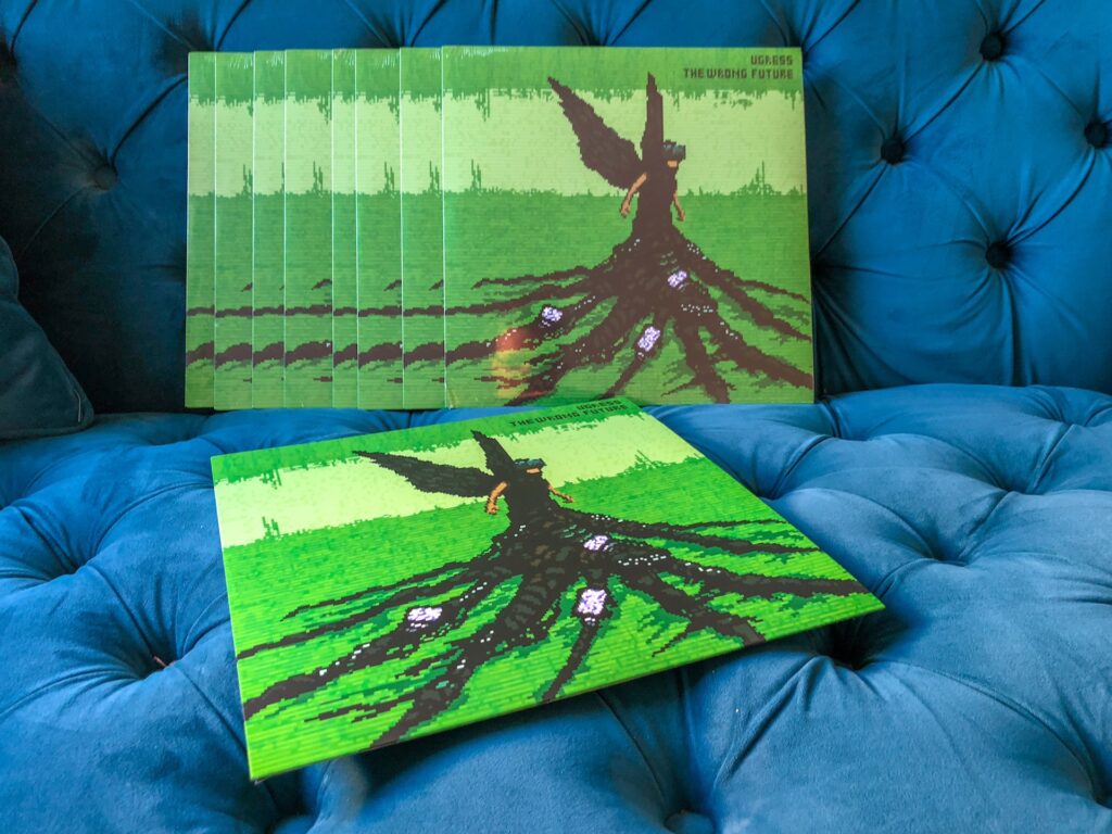
Vinyl LPs freshly arrived from the pressing factory.
I am very happy with both the end result and the process – it was a great pleasure and honour to work with Stephan, I don’t think I’ve ever had such an rewarding and respectful artistic dialogue. Communicating about the visuals at the same time as finishing the music was an important inspiration, both sides influenced and improved each other.
We had a beer together to celebrate now that the vinyl has arrived, and I think what we both really appreciate, is that this is a piece of art, its not a product. There are no barcodes, there are no copyright information, no warnings, no EULAs… its just a lovingly and thoughfully created vinyl record, made by two independent artists, crowd-funded by the fans, with eight tracks of music and 40 000 hand-drawn pixels.